POSTED ON: Jun 19, 2025
![]() Maria Alonso
Maria Alonso

You don’t have much of a choice; presenting your practice online has no alternative. Today, when everything has gone digital, a carefully thought-out and planned, easy-to-use website is something your audience will surely appreciate.
A practice lives or fades by its digital entry point. There’s no room for confusion here. No time to explain. Your website has to greet a stranger and be appealing and trustworthy enough to make them stay. Without eye contact or a steady handshake. With just a screen, some code, and a few seconds of goodwill. What patients notice first about your practice online is no guessing game.
Like it or not, every practice runs as a business. Whether you’re a dentist, pediatrician, or physical therapist, your visibility depends on how easily you can be found online and understood.
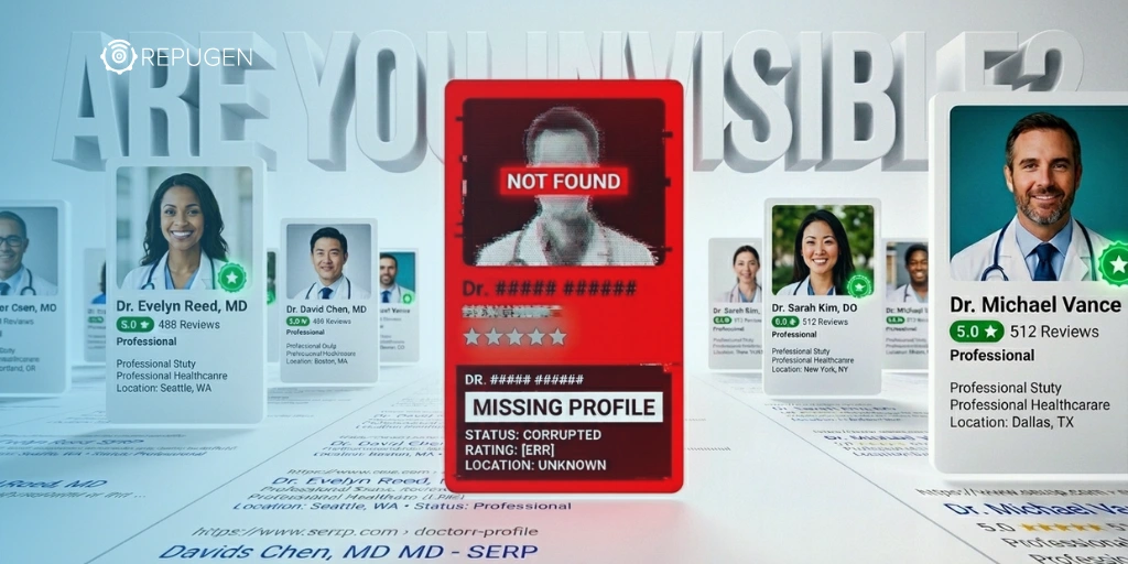
According to a Forbes study, a business’s online presence will have a massive impact on its success, regardless of industry. Many companies, even now, when everyone is online, underestimate how frequently potential clients check their websites first. Patients, too. They’ll Google before they call, and, needless to say, they’re not browsing Yellow Pages anymore. They want an answer that’s fast, a reason to trust.
If your online presence feels outdated, your practice will also feel outdated. Patients don’t have the time to explain their thinking to you. They’ll just opt for someone else.
The first few seconds are enough. Understanding what patients notice first about your practice online is a study of speed, clarity, tone, and aesthetic decisions made without words. Let’s break it down.
Speed matters. A website that stalls will drive patients away and damage your reputation. People expect information now. If your homepage takes four seconds to appear, with photos lagging behind it, many will already have backed out and picked the next search result. And that click is often permanent; they won’t come back.
And it’s not just about your potential patients’ decisions. Search engines also prioritize fast websites. Slow speed will do some damage to your rankings. Speed is a basic requirement. A fast site says: we’re there, we’re prepared, we respect your time. Even if never spoken, that single impression will stay with your website visitors.
Navigation should require no explanation. Patients arrive with a goal – find your services, check your qualifications, and maybe see where your office is or when you're open. They should get the information they need in no more than two or three clicks. If a patient is confused, lost, or annoyed by poor site architecture, they won’t think twice before they leave.
A flashy design won’t help much. This should be a lesson in simplicity. Logical menu structures. Contact information in plain sight. Mobile-friendly layouts. Consistent icons and structure. Patients want direction without delay.
Good UX removes friction, and in healthcare, friction feels like carelessness. One can easily assume that’s the last impression a medical practice should leave.
Patients won’t read your website the way they read a book. They’ll skim through it looking for signals: professionalism, clarity, confidence. The tone should reflect the service – measured, direct, and calm.
Avoid fillers and clichés. No need for exaggerated claims. Don’t describe your care as state-of-the-art unless you’re able to prove it. Write what you do. Write for the people who are nervous, busy, or unsure. Use clear language to earn their trust.
Your website’s design should match the emotional setting of healthcare. Reassurance, clarity, safety. That means the following:
Design matters. Most people would rather judge a book by its cover, despite the advice not to. Every detail carries more weight than it seems.
A homepage takes care of the introduction. But patients often want to go deeper. They want more than surface-level polish.
Each service needs its own space. Don’t crowd everything into a single list. If you’re offering general checkups, tooth extractions, and allergy testing, those are different needs. Present each one clearly.
Use bullet points for procedures. Use shorter paragraphs for explanations. Show what you offer without making your patients hunt.
This is where they’ll meet you. Your credentials are important, but your photo is, too. Add your biography. Add context.
Patients want to see a human. Not a wall of text or a vague mission statement. A few lines on your background, training, and why you practice - that’s enough. Be specific.
Your patients want to know what others have experienced. Embed verified testimonials or links to review platforms.
Make sure they’re real, recent, and relevant (and that you’ve actually taken the time to listen to the reviews). A review from six years ago won’t help. But a review from last week might.
A website is not a one-time effort. Practices change. Services shift. Hours adjust. Bios get outdated. If your “News” section hasn’t been updated since the end of the last decade, it will tell your patients that you aren’t paying attention.
Therefore, review your content quarterly. Refresh the design every few years; no need for grand makeovers, as that’s something that patients might dislike. Delete anything that no longer reflects your current work. Patients assume your website reflects your practice, accurate or not.
What patients notice first about your practice online will become the memory they carry. You don’t get to sit beside them and explain what you meant. Your website should do that. Or it won’t.
So, build it to speak clearly. Edit it to reflect the reality of your practice. Let every pixel show that you care. That’s the first impression. And it’s the one that counts the most.

Recent Posts
0 Comment
Your email address will not be published. Required fields are marked *